The official UMBC athletics logo consists of a stylized Chesapeake Bay Retriever with an arched “UMBC” over its head. Its use – and all variations of the athletics brand – are limited to athletics materials and merchandise sold in the bookstore. It may also be employed for special occasions, such as Commencement and Convocation ceremonies. It should not be used by academic programs in place of the official UMBC shield logo. It should not be modified in any way.
Sizing the Logo | Incorrect Use
Retriever Image Use
UMBC’s mascot, the Chesapeake Bay Retriever, and its characterization, True Grit, are important parts of our campus culture and history. Students, alumni, faculty, and staff refer to themselves as “Retrievers” with a great deal of pride. The Chesapeake Bay Retriever, as a breed, exhibits a number of qualities found in UMBC’s students and alumni. They are extremely hard-working; sensitive and serious; and intensely loyal and protective of those they’ve grown to love.
Language and imagery related to the “Retriever” is woven throughout a variety of campus communications, on websites, print pieces, letters, signage, clothing, and more, including the campus magazine.
As we use the Retriever to help communicate the UMBC story, please follow these important guidelines to help maintain a consistency of brand and message:
- While the Retriever image, logo, and related Athletics marks are linked to many aspects of UMBC life, they should not be used to represent academics at UMBC. Consider, instead, using photographs of students, the library, the Honors logo, etc., to represent the academic element of the UMBC experience. For more information about proper use of the athletics logo, see below.
- No member of the UMBC community stands alone. When we use images of the Retriever statue, we should display it in a way that reflects our community. For instance, instead of displaying an image of the statue alone, it might include members of the community surrounding it.
Athletics logo variations
Primary logo
This variation is the preferred option for all communications, apparel, environmental graphics, and stationery (letterhead, business cards, envelopes, etc.). It can be used on white and black backgrounds. Please note that when this logo is placed on a gold background the outer gold edge should be changed to white (see example below).
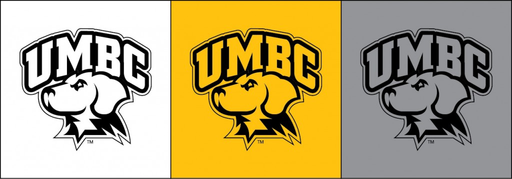
Single Color Alternatives
When using the primary logo in black (single color), please make sure the outer edge is represented (shown here with a thin outline). There are single-color alternatives available for each logo variation. Please contact Brand and Creative Strategy with any special retriever logo requests.
Fulldog logo
Individual sport wordmarks
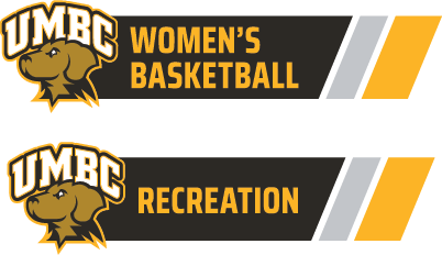
A wordmark variation has been created for each NCAA Division I sport the Retrievers participate in. In addition to the sports wordmarks, variants have been created for each Athletics Department. If you need a sport or department wordmark, please contact Brand and Creative Strategy.
Arched UMBC logo
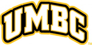
Brand and Creative Strategy is always available to offer a professional opinion if there is some question about which variation should be used for a particular project.
Sizing the logo(s)
Primary logo

Permitted minimum height: 1.5 inches.
Fulldog logo
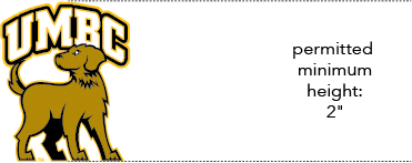
Permitted minimum height: 2 inches.
Sport and Department wordmarks

Permitted minimum height: 1 inch.
Arched UMBC logo

Permitted minimum height 1 inch.
Designers should strive for readability of all elements (the white of the eye, the UMBC, and the TM) when using the Athletics logo in their work. They should also avoid placing the retriever marks too close to other logos. An inch of clearance around the logo is recommended.
Examples of incorrect uses of the Athletics logo
1) DO NOT: Render the logo using variant typefaces
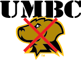
2) DO NOT: Add graphics, alternative colors, gradients, patterns, textures, or images to the retriever AND/OR arched UMBC. You can add elements to the UMBC paw print or the full-retriever silhouette. See this page for access to those elements.

3) DO NOT: Invert or reverse the colors
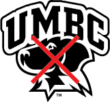
4) DO NOT: Change the orientation of the mascot or create alternative views. The mascot’s gaze was designed to face the competition in a normal Home vs. Away display of logos (where the home team is on the right). In addition, alternative views of the Retriever (like facing the viewer) are not allowed.

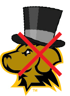
5) DO NOT: Add graphics to the logo (like hats). This includes adding elements inside the bite/to the mouth of the Retriever.
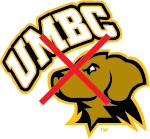
6) DO NOT: Reposition elements of the logo
7) DO NOT: Electronically condense or stretch the wordmark
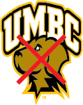
8) DO NOT: Mix the Retriever logo with the academic wordmark
