There will be instances (e.g., in the case of signage, promo items, and/or apparel) where a college, division, or office name is appropriate in combination with the UMBC logo (these guidelines also work for associations, centers, departments, institutes, programs, etc). Typography for such instances shows a connection to the University but also distinguishes itself from the logo in prominence. In the examples below, the university font (Avenir Next) is used with a gray rule to give space between the name and the UMBC logo. Please note: When multiple lockups are used to show sponsorship of an event, department names can just be listed next to a single UMBC logo.
“Lockup” Examples
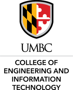
Option 1: The college/division/department/office/center/program name is included beneath the primary UMBC logo aligned to the left side of the “U”.

Option 2: The college/division/department/office/center/program name is included to the right of the vertical UMBC logo aligned to the same baseline as the acronym. This version can have three lines (with the last line aligned to the baseline of UMBC).

Option 2b: In some cases, the name of the college/division/department/office/center/program is shorter (from a character/word count) so this option gives a little more prominence to the name in relation to the UMBC vertical logo.

Option 3: This example shows an Office that is affiliated with a Division.

Option 4: This example shows a Program that has partnered with a Center.

Option 5: This example shows the option for a Donor-named space.

Option 6: This example shows the option for an institute with a UMBC-named initiative.

When sizing the logo options above, the minimum size should never be less than one inch (1″) in height. Brand and Creative Strategy should always be contacted to assist with the creation of these logo options.
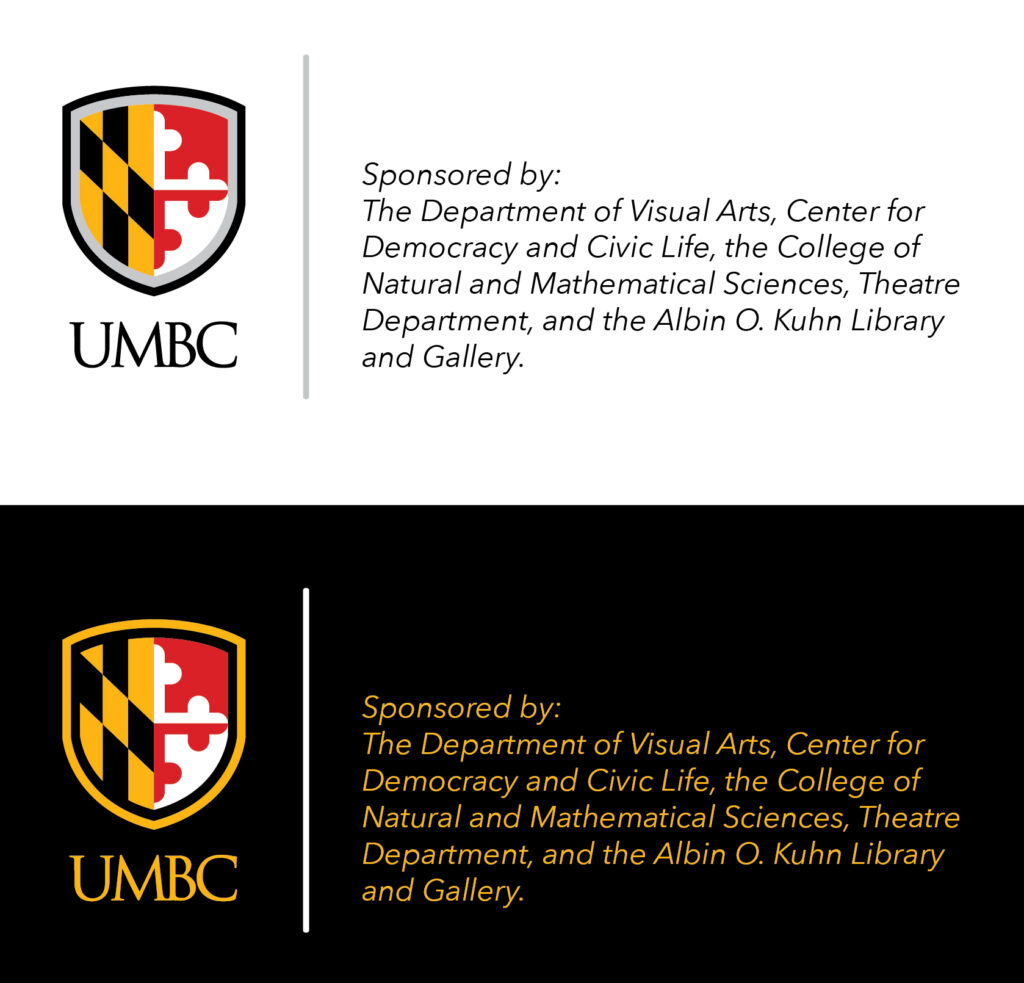
Please note: when colorizing the lockups for use on black, the UMBC logo should be the gold version found here. The gray line becomes white, and the typography should be gold to reinforce school colors. See the example below:

If you need assistance creating one of these lockups, please contact Brand and Creative Strategy.
Guidance for Multiple Lockups
There will be times when several groups are sponsoring an event. Rather than using multiple lockups, you can use a single UMBC logo, and list all the sponsors in type. See the example below:
Promo Item Options
There will be times when the above options do not work for specific promo items because the art area is too small. Below are a few examples of some of the alternatives that could be used. In most cases, these examples include a UMBC logo with the college/division/department/office/center name in Avenir Next (the university font).
Example 1: UMBC Police Polo
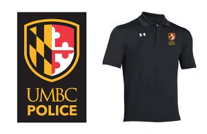
In the above example, the art area was vertical which meant a “lockup” would not work. The solution here was to use the vertical version of the UMBC logo with “Police” typeset underneath in Avenir Next Bold/all caps. The gold version of the vertical logo is best for this application since the polo is black.
Example 2: UMBC Graduate School Lanyard
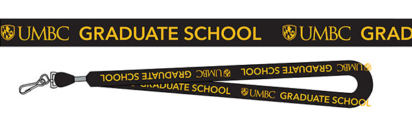
In the above example, a longer art area was defined. The solution here was to repeat the primary version of the UMBC logo with “Graduate School” typeset to the right in Avenir Next Bold/all caps. The gold version of the primary logo is best for this application since the lanyard strap is black.
Example 3: UMBC Graduate School Pen
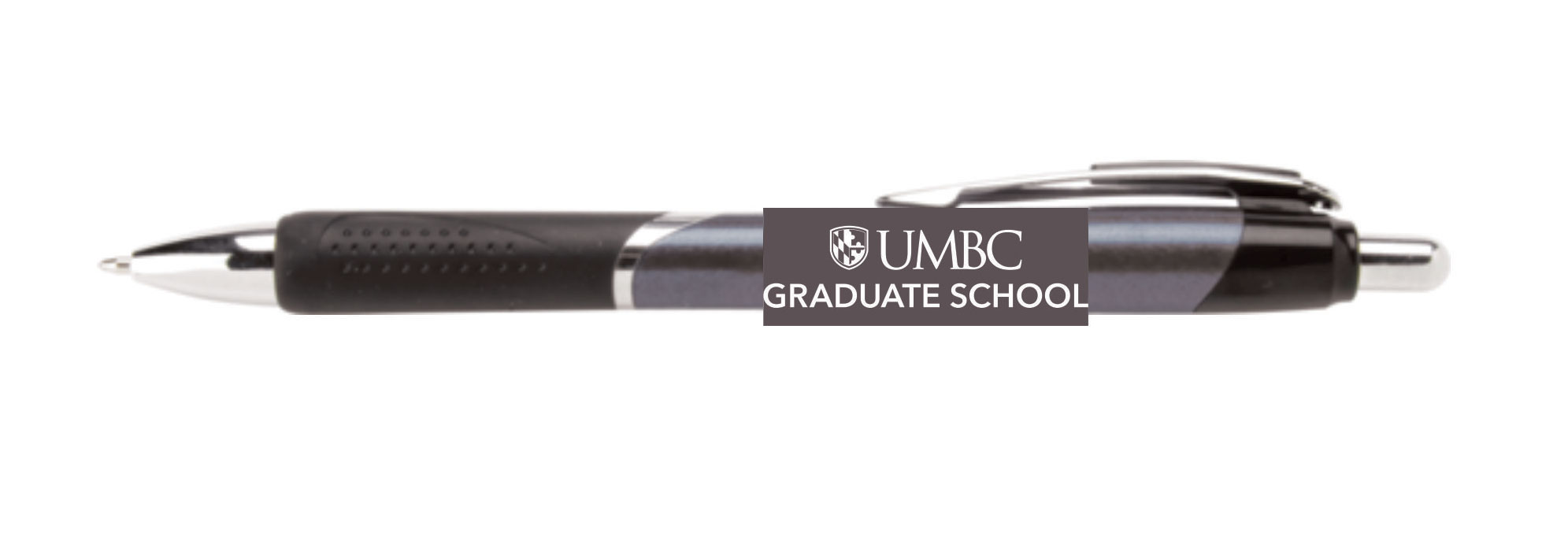
In the above example, again the art area was too small for a “lockup.” The solution here was to stack a white version of the primary UMBC logo with “Graduate School” typeset underneath in Avenir Next Bold/all caps. A white version of the primary logo is best for this application since the pen body is pewter.
Example 4: Vertical Lockup
In the above example, the lockup system is adjusted for vertical applications. Please consult with Brand & Creative Strategy if you need this variation.
Example 5: Department Acronyms

In the above example, we’re working with a smaller, square art area. This solution includes the department acronym with a broken shield and UMBC wordmark. This can be colorized for use on different color backgrounds. Please consult with Brand & Creative Strategy if you need this variation.
Other UMBC logos: Primary UMBC Logo | Retriever Logo | Grit & Greatness Campaign Logo